
Hollywood Bathroom Remodeling Hollywood and nearby cities
Bathroom Color Palettes That Feel Calm and Cohesive
A bathroom palette is built from many small choices: tile, paint, metal, wood, glass, and light. This guide shows how to make them work together so the room feels settled instead of busy.
 Hollywood Bathroom Remodeling
Warm design. Clear planning.
Color planning guide
Start with the mood, not the swatch
Most people begin choosing color by walking through a showroom and pointing at what catches their eye. That is a fine way to collect ideas, but it is a poor way to make decisions, because a swatch tells you nothing about how it will sit beside everything else. A better beginning is to decide how you want to feel when you walk into the room. Calm and spa like? Bright and fresh? Warm and cozy? Dramatic and rich?
Once you have a feeling, color choices get easier because you have a test to apply. Does this tile support the calm you want, or does it fight it? Does this paint warm the room, or make it feel cold? A palette is just a set of choices that all answer the same question.
Bathrooms are also unusual rooms. They are small, they are full of hard surfaces, and they hold fixtures that cannot be changed easily. That means the palette has to respect what is permanent and bring in flexibility through things you can swap later, such as towels, art, and accessories.
It helps to gather inspiration in a disciplined way. Collect photographs of bathrooms you love, then look for what they share. Often the pattern is not a specific color but a relationship: pale surfaces with one dark accent, warm wood against cool stone, or a single bold wall in a quiet room. Naming that relationship gives you a guide you can apply to your own home, with your own light and your own layout.
The big surfaces come first
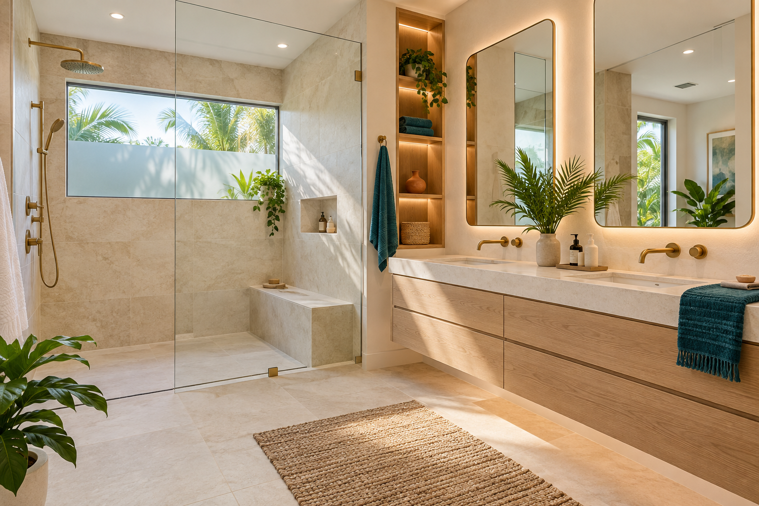
In most bathrooms, a few large surfaces carry the color story: the floor, the shower walls, the vanity, and the main wall paint. These are the choices that set the tone. Smaller elements, such as hardware, mirror frames, and lighting, then support the story rather than writing it.
A useful rule of thumb is to choose one dominant color family, one supporting family, and one accent. The dominant color might be a soft warm white or a pale gray. The supporting family might be a wood tone or a darker tile. The accent might be a metal finish or a single patterned surface. When every surface competes for attention, the room feels noisy.
Make these decisions together rather than one at a time. If you pick a floor tile in January, a vanity in March, and paint in May, the colors may never meet in your mind until they meet in the room. Our planning page on the bathroom selections schedule explains why deciding in the right order matters.
The vanity deserves a special mention because it is both furniture and a color statement. A painted or stained vanity can be the focal point of the room, with quiet tile around it, or it can blend in while a bold floor takes over. Choose which surface will lead, and let the others support it. When two big surfaces both try to lead, neither wins, and the eye has nowhere calm to rest.
Understanding undertones
Almost every neutral has an undertone. White can lean warm, with a hint of cream or yellow, or cool, with a hint of blue or gray. Gray can lean toward green, blue, or purple. Beige can lean pink or yellow. Undertones are why two whites that look identical in a small chip look completely different once they are on a wall next to a tile.
The trick is to match undertones across the room. If your tile leans warm, a cool white wall will make the tile look dingy. If your countertop leans cool, a creamy paint will make it look chilly. Hold samples next to each other, and compare them in the actual room rather than in a store, because store lighting hides these differences.
Do not worry if the match is not exact. What matters is that the undertones feel related. A warm gray and a soft cream sit well together, and a crisp white with a cool gray does as well. The eye forgives variety but not conflict.
A practical test is to place your samples on a white sheet of paper, then on a gray one, then next to each other. Against white, undertones jump out. Against gray, they quiet down. If a pair of samples looks friendly in both settings, it will probably be friendly on the wall. Samples that only work in one setting are usually relying on a trick of lighting that will not hold up at home.
Tile as the anchor
Tile is usually the largest and least changeable surface in a bathroom, so it tends to be the anchor of the palette. If you choose tile first, everything else can be matched to it: paint, vanity, metals, and accessories. If you choose a vanity or a fixture first, the tile has to be chosen to flatter it.
Think about how the tile will look in the room, not on a sample board. Glossy tile reflects light and brightens a space, while matte tile absorbs light and feels softer. Tile with variation in color, such as a stone look porcelain, adds movement and can make a plain palette feel rich without adding extra colors. Our guide on matte versus glossy bathroom tile explores that choice.
Grout is part of the palette too. A grout that matches the tile makes the surface look continuous and calm. A contrasting grout outlines each piece and creates a pattern. Both can be beautiful, but the second is a stronger statement and works when used on purpose. For more on tile choices in our climate, see choosing tile for a Florida bathroom.
- Decide whether the tile will be the anchor or the supporting character.
- Look at samples under the room's own light.
- Choose grout color deliberately, not as an afterthought.
- Compare gloss levels, since they change how color reads.
- Check that the floor and wall tile share an undertone.
Paint, finish, and humidity
Paint is the easiest part of a palette to adjust, but it is also the surface most affected by the room's moisture. Bathrooms need finishes that tolerate humidity, and the finish you choose changes how color looks. A satin finish reflects more light than a flat one and tends to show every wall imperfection, while a matte finish hides flaws but may mark more easily.
The color itself shifts with light. A soft green can look gray in a north facing room and fresh in a sunny one. A bright white can feel stark under cool bulbs and cozy under warm ones. Always test paint on the wall and look at it in the morning, in the afternoon, and at night with the lights on.
Remember that paint meets tile at a line. Choose a paint that flatters the tile above all, because the tile is harder to change. Ceilings count as well: a ceiling in a slightly lighter or softer tone than the walls lifts the room, while a ceiling the same color as the walls can feel enveloping. Our page on bathroom painting and finishes explains why humid rooms call for moisture tolerant products and careful preparation.
Metals and how many to mix
Faucets, shower trim, cabinet pulls, towel bars, mirror frames, and light fixtures all introduce metal. The classic advice is to choose one metal finish and repeat it. That works, and it gives a calm, consistent look. But mixing metals can also be beautiful when it is done on purpose, with a clear dominant finish and a smaller accent.
If you mix, limit yourself to two finishes, and make one clearly the main one. Place the accent where it will repeat at least twice so it looks like a choice rather than a mistake. A brass mirror frame with matching light fixtures and a black faucet, for instance, reads as a plan if a few other black details appear elsewhere.
Finishes from different makers rarely match exactly, even when they carry the same name. Look at them together in the bathroom before ordering. Our guide on bathroom faucet finishes goes into how finishes age and what to ask about them, and bathroom hardware and pulls covers the smaller pieces.
Hot, humid, salt tinged air is also a reason to ask about finish durability. Some metal finishes hold their color well in a damp room, while others spot or darken. A finish that wears badly turns a carefully built palette into a disappointment within a season or two. Ask your supplier how a finish is expected to age in a bathroom, and favor those with a track record in humid conditions.
Wood tones and warmth
Wood brings warmth to a bathroom full of cool, hard surfaces. A vanity in a warm wood tone, a wood look floor, or a wooden shelf can soften tile and stone. In humid rooms, the material has to suit the environment, so ask your remodeler which wood or wood look materials are suited to a bathroom and how they should be finished.
When choosing a wood tone, consider its undertone just as you would for white or gray. A reddish wood next to a cool gray tile can clash, while a honey tone next to warm white can feel soothing. If you are using more than one wood tone, make them the same family or clearly different, not almost the same.
Remember that wood and wood look pieces age and shift in color over time, especially in rooms with strong sun. A sample on a sunny windowsill for a few days tells you more than a catalog photograph. Our page on custom bathroom cabinetry describes how cabinet materials and finishes are planned.
Stone and solid surface countertops bring their own color and veining to the palette. A countertop with strong movement is a feature on its own and usually wants quieter neighbors. A plain countertop leaves room for a lively backsplash or tile. Look at the countertop slab or sample at full size when possible, since a small chip hides the pattern that will cover the whole top. Our page on bathroom countertops goes deeper.
Light changes everything
Light is the invisible ingredient in every palette. Natural light changes through the day and through the seasons. Artificial light changes with the color temperature of the bulbs. A palette that looks perfect at noon can look different at night under warm bulbs, and a palette chosen under cool store lights can look yellow at home.
Plan the lighting along with the colors. Warm bulbs make warm palettes glow and can make cool palettes look muddy. Cool bulbs sharpen cool palettes and can make warm ones look flat. Our guide to bathroom lighting color temperature explains how to choose and why consistency across fixtures matters.
Windows matter too. A bathroom with a lot of daylight can carry deeper colors without feeling heavy, and a windowless bathroom may need lighter colors and more careful lighting. Look at the page on natural light and windows if you are thinking about changes to the openings in the room.
Mirrors multiply light and color, so what they reflect matters. A mirror facing a colorful wall doubles that color in the room, while one facing a window brings in sky and greenery. Think about what you want repeated before hanging a large mirror, and see our guide to pairing mirrors with lighting for ideas on how mirror and light work together.
Small rooms, big rooms, and dark colors
There is a common belief that small rooms must be painted white. In truth, small rooms can handle dark, rich colors, and a powder room is a classic place to be bold. What matters is whether the room is lit well and whether the color is used with intention.
In a larger bathroom, you can break the palette into zones: a calm shower area, a warmer vanity wall, and a neutral floor. In a small bathroom, keeping the palette tight, with few colors and a repeating material, usually feels more spacious. Visual breaks, such as many contrasting stripes, chop a small room into pieces.
Think about sight lines. From the doorway you see a certain view, and that view should be the most flattering one. A beautiful vanity wall, a feature tile in the shower visible through glass, or a window with soft light all make a strong first impression. Our page on powder rooms and half baths explains how small rooms can carry a bold idea.
Testing and committing
Before you commit, build a sample board or a simple tray. Put the tile, the paint chip, the vanity material, the metal sample, and any wood together, and look at them in the room. Move them around. Look at them in the morning, in the evening, and with lights on. If something feels off, trust that feeling and swap it out.
Take photographs, too. Cameras flatten color, but they also show proportions, and they let you step back from your own excitement. Share them with your remodeler, who can point out practical concerns such as how a pattern will be laid out or how a trim will meet the paint.
Give yourself a cooling off period, too. A palette that excites you in a showroom may feel different after a week of living with the samples. Leave them in the room, walk past them on ordinary days, and see whether you still smile. If a choice still feels right after a quiet week, it probably is. If it begins to feel tiring, you have saved yourself from a decision you would have lived with for years.
This guide is general advice for homeowners planning a bathroom. Your own taste, your home, and your light make the final decisions, and a good remodeler will help you test them rather than hurry you toward an answer. Take the time to live with samples, ask questions, and change your mind before materials are ordered, when changing is still simple and costs nothing but a little patience. When you are ready to plan the whole room, our overview of complete bathroom remodeling shows how color choices fit into the larger process.
Good to know
Common questions
How many colors should a bathroom palette have?
Most calm bathrooms use one dominant color family, one supporting family, and one accent, often a metal finish. More than that can feel busy, especially in a small room. Repeating materials and finishes helps even a varied palette feel unified and intentional.
Should I choose tile or paint first?
Choose tile first in most cases, since it is the largest and least changeable surface. Paint can then be matched to it, tested in the room's own light. Choosing paint first can leave you hunting for tile that fits, which is harder than the reverse.
Can I mix metal finishes in a bathroom?
Yes, if you do it on purpose. Pick one main finish and one accent, and repeat the accent in at least two places. Finishes from different makers rarely match exactly, so compare samples together in the room before ordering.
Will dark colors make a small bathroom feel smaller?
Not necessarily. A small room with good lighting can look rich and intimate in a deep color, and powder rooms are often a good place to try one. A dark palette does need careful lighting and attention to how tile and paint meet.
Why does paint look different at home than in the store?
Store lighting differs from your bathroom's light, and undertones shift with bulbs, windows, and nearby surfaces. Test samples on the actual wall and view them in morning, afternoon, and evening, with the lights on and off, before you commit.
How do I keep a bathroom palette from looking dated?
Anchor the permanent surfaces in calm, timeless tones and use color through easier to change items like towels, art, and accessories. Strong trends are fine for small touches. Choosing a mood rather than a fashion keeps the room feeling right for longer.
Your bathroom starts with a conversation